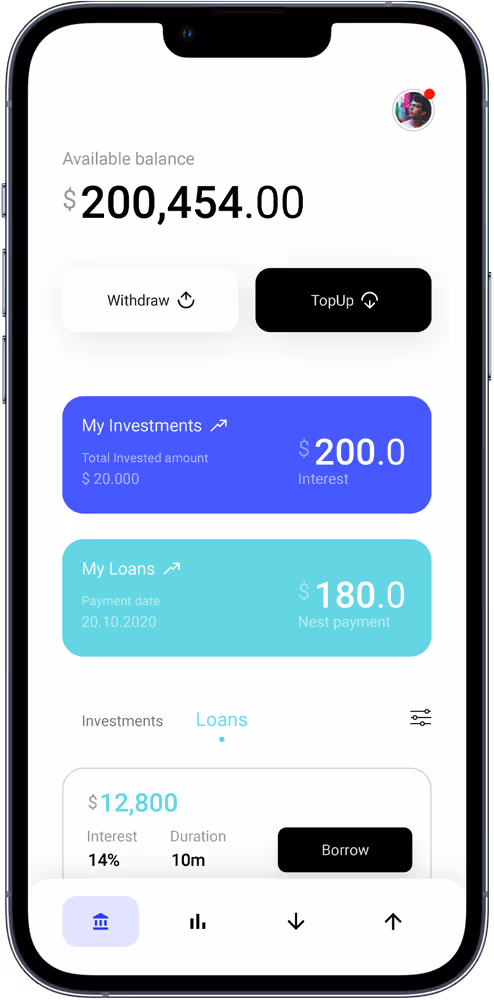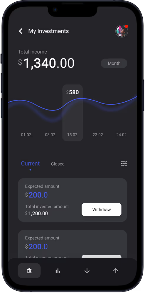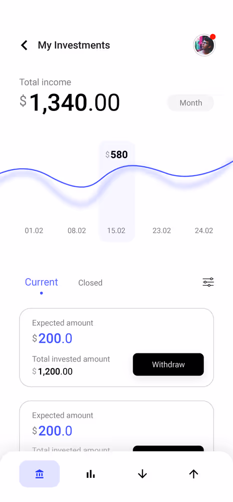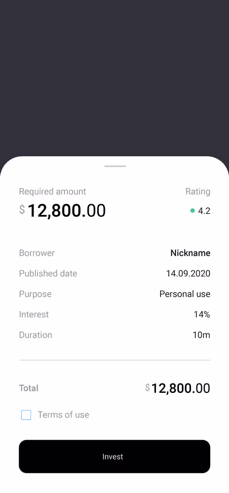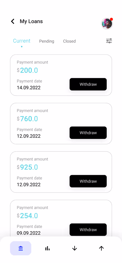
The P2P lending platform directly links people who need a loan with potential lenders. It can fill a demand for credit from consumers and go part way to solving a longstanding problem of getting financing to small businesses.
Research
User Interviews
Content Strategy
UX Strategy
Visual Language
UI/UX Design
Product Design
Prototyping
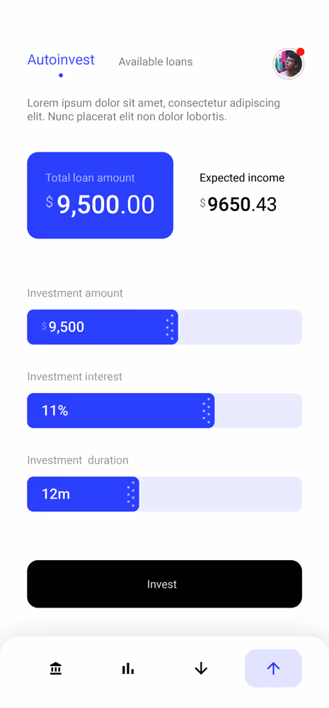
C2C
Mobile App
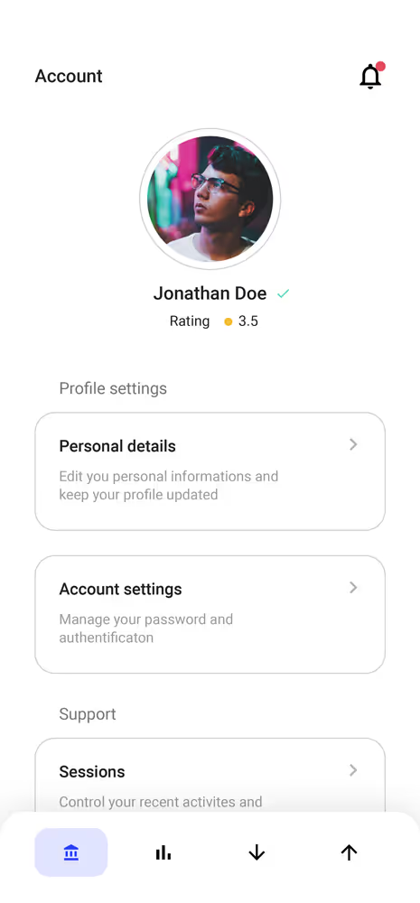
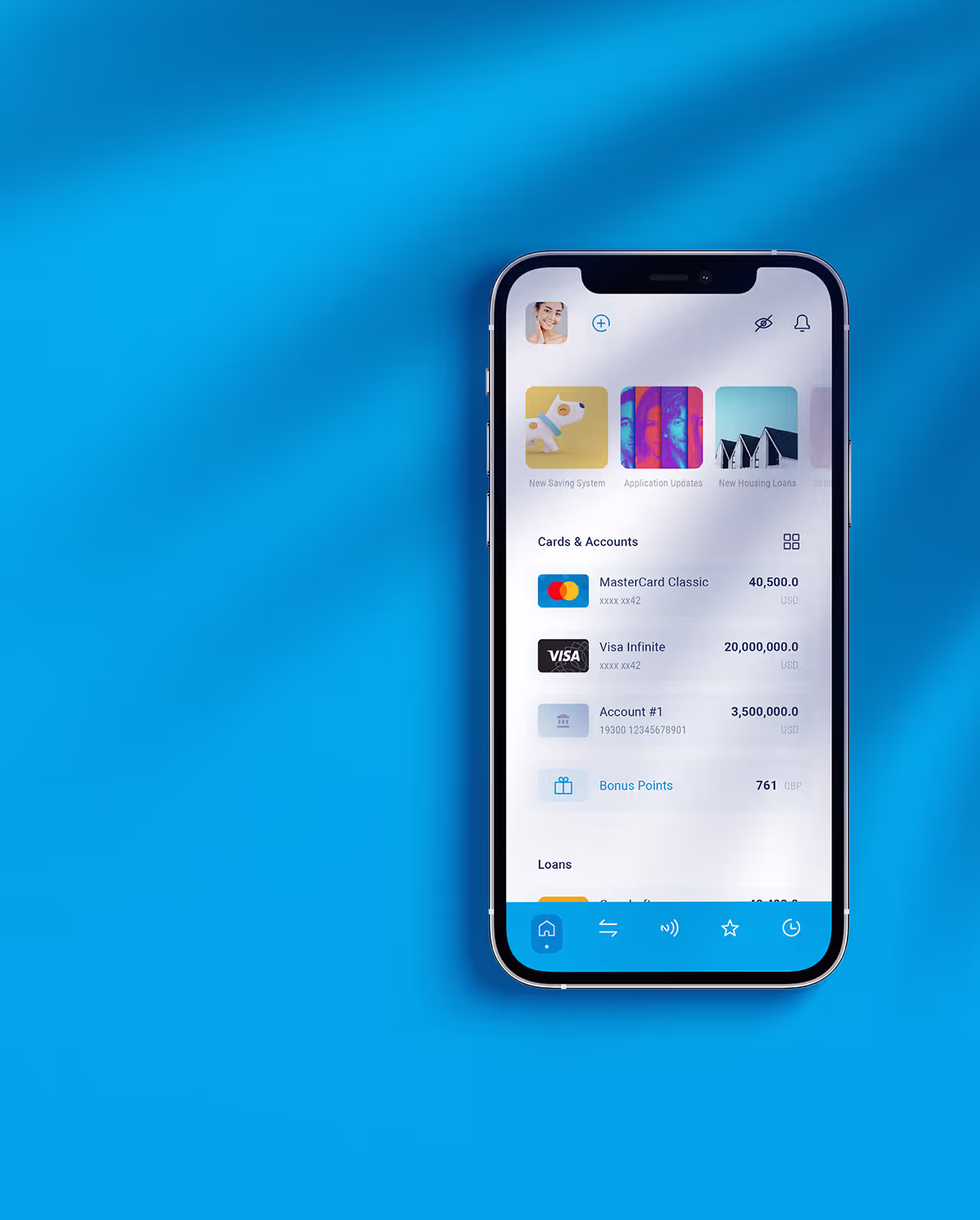
When it comes to the UI/UX of the P2P Lending app, we have to take into account that the person's financial life involves not only the user and his money, but also contains dozens of financial products that solve different financial needs.
Considering this, the task was based on these key elements:


Modern technology has taken banking to a whole new level. Ease, speed, enjoyment, and convenience are rewriting the history of the user experience in the financial world. The P2P lending platform directly links people who need a loan with potential lenders. It can fill a demand for credit from consumers and go part way to solving a longstanding problem of getting financing to small businesses.
While regulatory obligations often require that financial apps behave in a certain way, there are opportunities to make the experience fun and hassle-free for users while still keeping it professional and easy to use. With the appropriate context, financial apps can offer a pleasant and interesting user experience instead of following the drab status quo model.
The challenge was to adapt to Material Design and the Human Interface guidelines while keeping in mind that we want to create something simple and lightweight. We aimed to create a unique, safe, and easy to use experience.
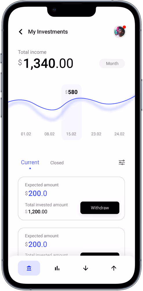
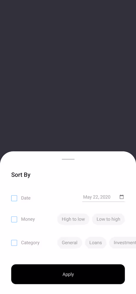
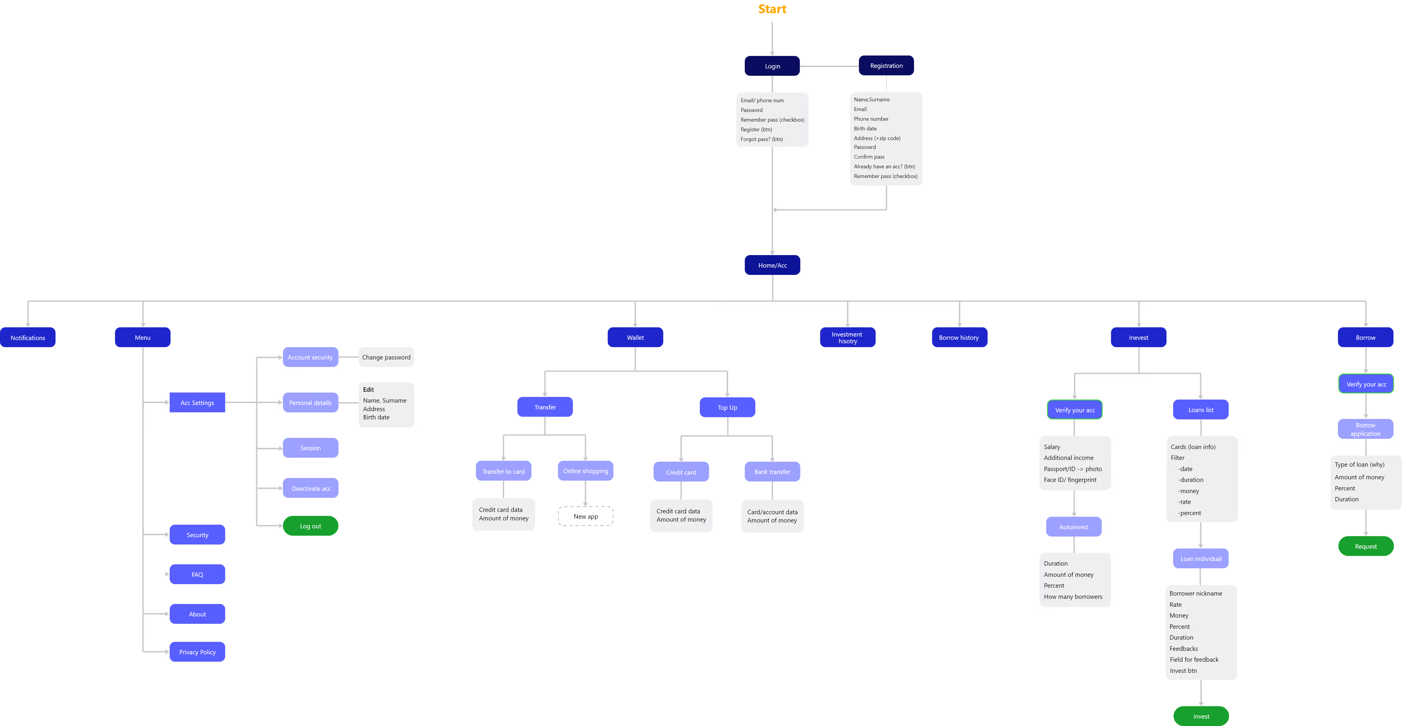
The application had an information overload and displayed too many services and transaction types, making the menu tough to perceive. We also identified that most users had difficulty navigating numerous pages and services. To solve this issue, we decided to eliminate the "menu" section and prioritize the services based on the usage rate, easing the user's decision-making process.
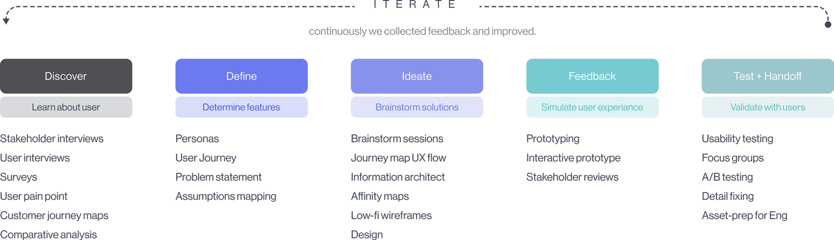
We made a deep dive into both qualitative and quantitative research by conducting competitor analysis, interviews and surveys. Based on the research results, the main approach was to find a way to fulfill people’s needs smarter and with simplified flows.
The design principles to keep in mind while we start sketching our solutions were:
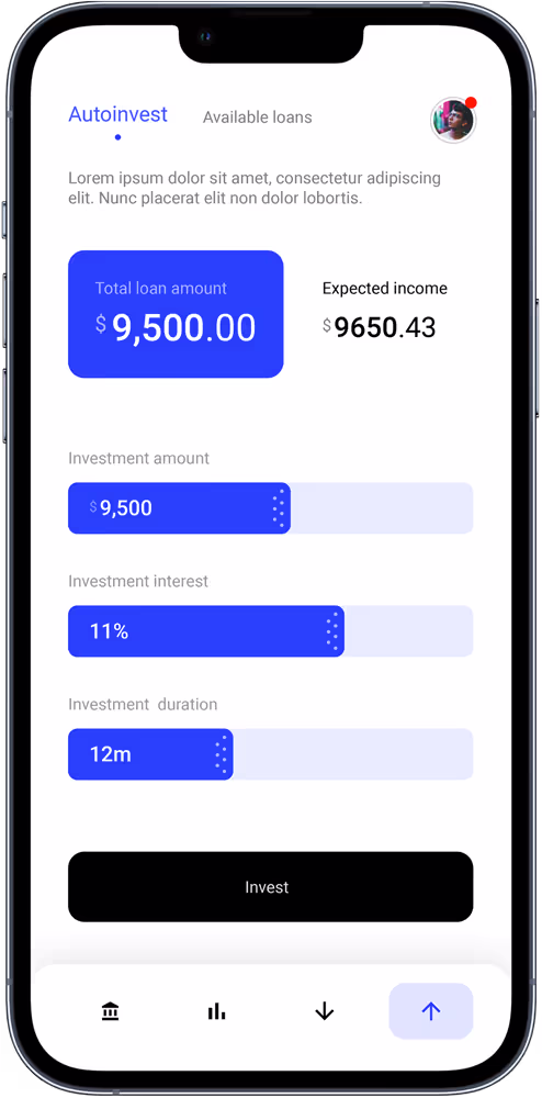
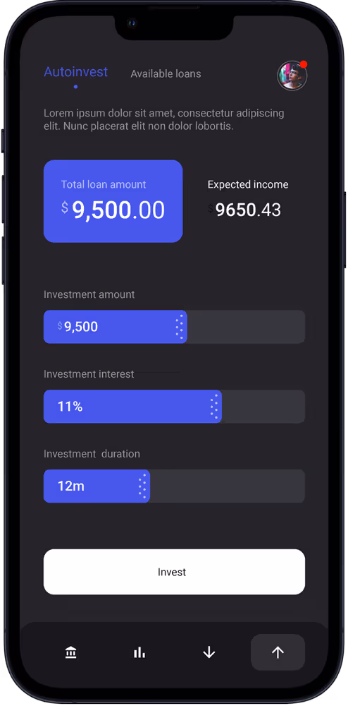
P2P lending is a complicated thing, entertain and educate the users at the same time without being a boring teacher.
The lender as the users didn’t just come for profit but to help the borrower, let them be inspired and know what impact they would have made with this platform.
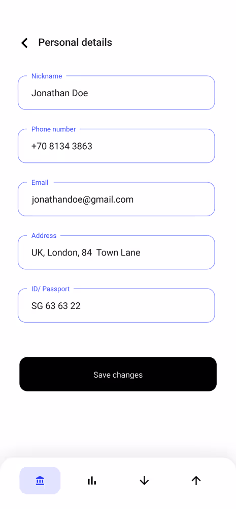
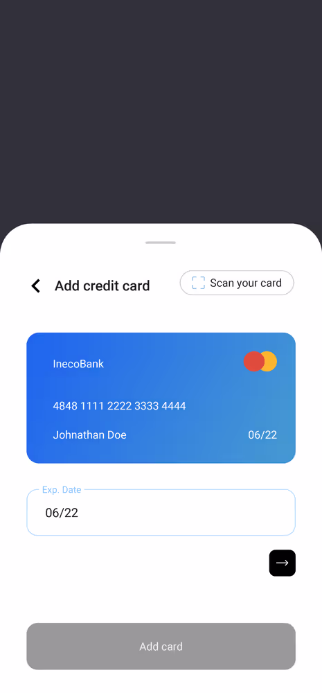
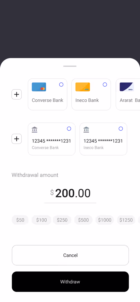
We talk about money, assets, and lending so security is a thing. No hidden information and every important step proceeds with caution.
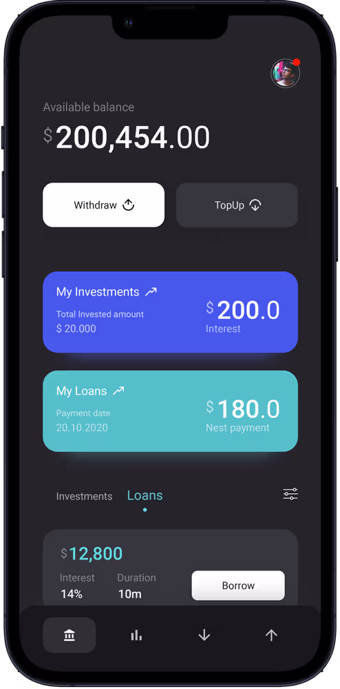
Looks good, day or night